OVERVIEW
Trilio provides a cloud-native backup and recovery solution for Kubernetes environments. The platform enables customers to manage, protect, and recover data across multiple clusters. As the product evolved, the user interface had become complex and potentially confusing for users, necessitating a redesign to improve usability while maintaining functionality.
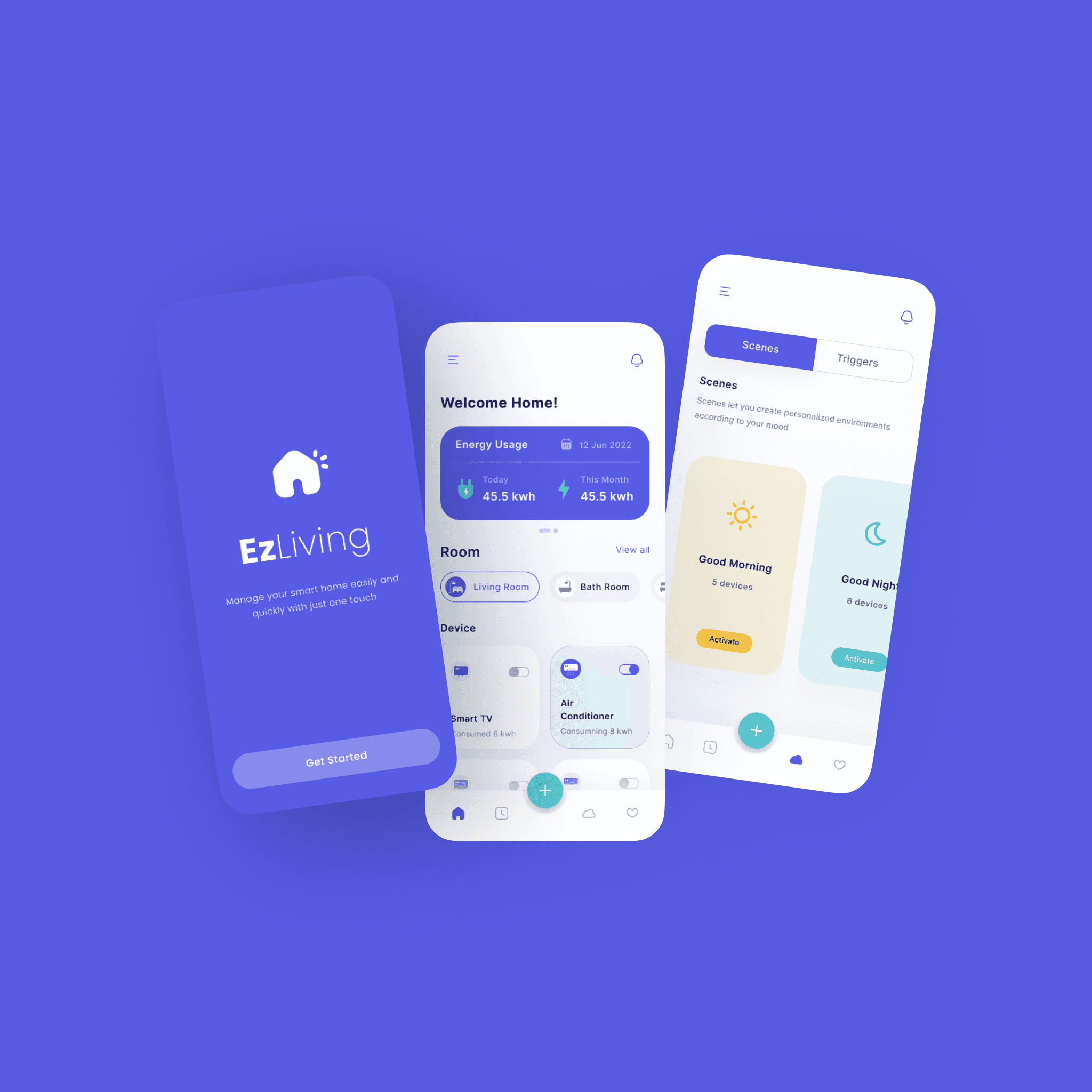
As a Senior Product Designer, I was responsible for designing new features, refining existing designs, and ensuring that the new UI was both functional and visually appealing. The designs created by me were implemented 100% and used for demo purposes and can be found in various demo videos on YouTube and Trilio's web page.

Role
UX Researcher

Responsibilities
UX Research & Design

Tool
Figma, FigJam, Canva, Powerpoint

Duration
2 Weeks
Business Goals
Improve User Experience: Create a more intuitive and streamlined interface that reduces confusion and cognitive load for users.
Reduce Customer Support Issues: Address existing UI-related customer complaints.
Maintain Feature Parity: Redesign the interface without removing critical functionality that customers rely on.
Enable Multi-Cluster Management: Simplify managing backup and recovery operations across multiple clusters.
Support Rapid Implementation: Design changes that can be implemented quickly and safely, with minimal backend modifications.
As the Senior Product Designer and leading the project, I spearheaded the redesign of the user experience. My tasks included conducting discovery research, prototyping, and usability testing, all while collaborating closely with engineers and stakeholders.

Discovery & Research
Understanding User Pain Points
I conducted a thorough UI audit to identify inconsistencies and usability issues across the existing designs and collaborated with the product manager and customer support team to gather feedback from enterprise customers like Progressive, Katarevich, and v3main.
Key Insights:
Users found backup workflows confusing due to nested forms and unclear steps.
The dashboard was cluttered, lacking actionable insight.
Navigation was unintuitive, especially for managing multiple clusters.
Terminology and interactions were inconsistent, increasing cognitive load.
🗣️ "The logic isn't clear—especially when creating or restoring backups." – Product Manager and customers
🗣️ "The UI is confusing, everything is in one screen and lot of information. I think it can be simplified" – Customers
🗣️ "Dashboard can have comprehensive information of clusters. We can think of cards and tables" – Product Manager

Identified Issues

Competitive Analysis
The analysis encompassed a comprehensive range of competitors within the Kubernetes backup and recovery ecosystem, evaluating their feature sets, user experience design, and core differentiators across multi-cluster data protection workflows.

Define
Key Findings - Framing the Problems
I distilled the findings into key UX challenges
UX Problem:
Complex workflows
Inconsistent interface
Overwhelming information
Poor navigation hierarchy
User Impact:
Errors during backup creation
High learning curve for new users
Hard to prioritize actions
Users couldn't find or complete tasks efficiently
HMW Statement
“How might we redesign Trilio’s user interface to streamline complex backup workflows, improve navigation, and reduce cognitive load—ultimately increasing user confidence and task efficiency?”
Develop
Designing for Clarity and Flow
With a focus on user-centered design, I brainstormed and refine user flow, prototyped improvements in close alignment with engineers and the PM:
Created step-by-step wizard for backup creation to reduce mental load.
Designed a modular dashboard showing key metrics, alerts, and statuses.
Simplified the side navigation, logically grouping features.
Introduced a clear visual hierarchy using consistent UI components and iconography.

Low Fidelity Wireframes

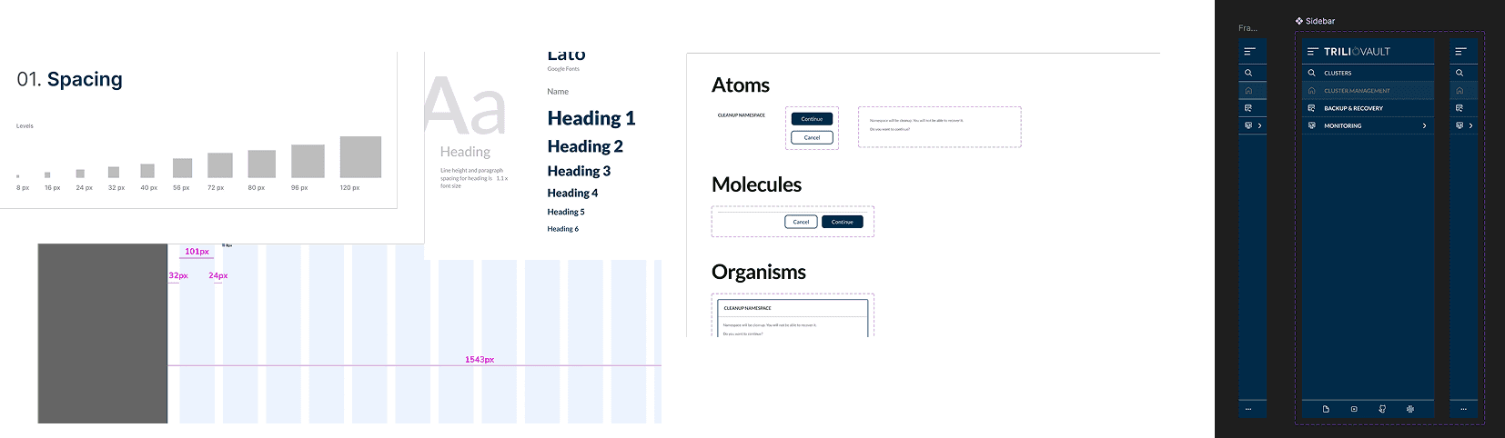
Cohesive Design System by applying atomic design approach, Prototype & Collaborate
I Applied an atomic design approach, starting with the creation of core elements Buttons with consistent states and actions, form inputs and selectors with clear visual hierarchy, modals and tables designed to handle complex data. Developed low-to-high fidelity prototypes in Adobe XD and Figma.
Presented interactive demos to stakeholders and internal DevOps teams.
Refined designs iteratively based on feedback and feasibility discussions with developers.
Used Zeplin for clean developer handoff, with all specs and redlines included.
Test & Validate
I conducted internal usability testing sessions with the DevOps team, guiding users through both the old and new workflows, gathering real-time feedback, and measuring time-to-completion and ease-of-use for each flow.
Deliver
Refined User Experience
Simplified the creation of backup plans with a user-friendly form with a step-by-step process, reducing cognitive load, complexity and ensuring that users could set up backups quickly and accurately.Clean Unified Dashboard: Clear visibility into backup health and recent activity.
Simplified and user-friendly design that focuses on minimizing visual clutter, cognitive load, ensuring that all users, can easily interact with the product.
Designed a streamlined dashboard to provide a comprehensive overview of backup activities.Introduced a more organized side menu, grouping related features and making it easier for users to access key functionalities with fewer clicks.
Consistent UI: Standardized components across the platform.

Quantified Impact
Simplified Processes: Improved usability and reduced the time required to create backup plans.
Improved Monitoring: Enhanced data visibility through intuitive charts and dashboards provided better visibility into backup health, helping users quickly identify and resolve issues.
Positive Feedback: Increased adoption and satisfaction among DevOps teams and fewer support requests related to usability, validating the design improvements due to a cleaner, more organized interface.
100%
Adoption of Design System
25%
Faster design to build
30%
User satisfaction scores increased, as indicated by post-launch surveys
25%
Reduction in support tickets related to navigation and usability issues.
Lessons and Outcome
Lessons Learned
This project reinforced how powerful simplifying complex systems can be—even technical users appreciate clean, thoughtful UX; it also highlighted the value of early user feedback in avoiding design missteps and showed how close collaboration with engineering drives faster, more accurate implementation.
Project Outcome
Designing for Kubernetes backup tools challenged me to balance technical complexity with clarity and usability. It really sharpened my ability to create intuitive, data-heavy interfaces, work cross-functionally to untangle deeper UX issues, and deliver meaningful impact through research-driven, user-centered design.