Pulse App
Noda VR is a virtual reality mind-mapping tool that helps users visualize and organize ideas in a 3D space. Unlike traditional 2D tools, it allows you to build and share 3D mental models - mind maps, storyboards, network or flow diagrams, project plans - to enhance your productivity, understanding and awareness.
Pulse is a mobile application for iOS and android, for all GSLAB employees and management. It helps in booking lunch/snacks (daily/weekly), conference room, to find the other employee contact details, to broadcast the messages, reporting the incident if any and checking notifications.


Role
UX Designer

Responsibilities
UI Design, Prototype Testing

Tool
Illustrator, Photoshop, Invision, Zeplin

Duration
3 Months
The Problem
I then explored following questions:
1) How will people book the meal daily/ weekly, conference room, find other employees contact information, broadcasting messages?
What are people trying to accomplish?
How can the app's user interface and experience be tailored to meet the diverse needs and preferences of employees across different roles and departments?
2) How might we enhance the current experience and streamline these processes?
How can we consolidate these tasks into a centralized and user-friendly platform?
How can we improve the efficiency and convenience?
How can we bring new value to employees by introducing features or capabilities they may not have realized they needed?
Solution
1
Enhance User Experience
Simplify the backup and recovery processes with intuitive design.
2
Improve Navigation
Streamline navigation to allow users to find and execute tasks efficiently.
3
Consistent UI Elements
Implement a cohesive design system provided by Trilio for consistent and recognizable UI elements.
4
Data Representation
Improve clarity in data visualization to help users make informed decisions quickly.
5
Design New Features
Develop new functionalities to enhance the overall capabilities of the app.
Solution
Applied design thinking methodologies to brainstorm and prototype innovative solutions that cater to user needs and business goals.
View more screens on

TrilioVault Dashboard Screen
Cluster Overview: Displays a summary of total clusters with their status.
Backup and Restore Summary: Shows the total number of backups and restores with their success, failure, and in-progress status.
Cluster Details: Provides detailed information on each cluster, including provider, Kubernetes version, license expiry date, CPU, memory, and pod usage.
Create New Backup Plan - Application Screen
The Create New Backup Plan screen guides users through the process of setting up a new backup plan for their applications.
The configuration step includes, selecting the namespace, backup plan name, target, encryption settings. Users can also configure hooks, scheduling policies for full and incremental backups, and retention policies. This step-by-step form ensures that all necessary details are captured for effective backup management.

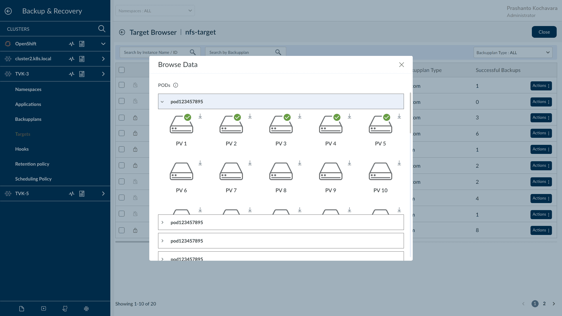
Browse Data Screen
The Browse Data screen allows users to view and interact with their backed-up data.
Users can browse through different Persistent Volumes (PVs) associated with their Kubernetes pods. Each PV is displayed with an icon and options to download the data, providing a clear and straightforward interface for managing backups.
Settings Screen
The Settings screen in the TrilioVault Kubernetes Backup and Recovery app allows administrators to customize the application's appearance and functionality by:
Uploading a Custom Logo: Personalize the interface with a custom logo.
Uploading CSS Files: Customize the visual styling by uploading modified CSS templates.
Uploading JSON Files: Update configurations by uploading modified JSON templates.
Uploading a Custom Favicon: Change the browser tab icon with a custom favicon.

Outcome
1
Improved User Satisfaction
User satisfaction scores increased by 30%, as indicated by post-launch surveys.
2
Positive Feedback
Received positive feedback from users and stakeholders on the usability and performance improvements, leading to a 25% reduction in support tickets related to navigation and usability issues.
3
Design Approval and Usage
The designs were fully approved and are now prominently featured in product demos and YouTube videos, showcasing their effectiveness and appeal.
4
Revenue Growth
The improved user experience contributed to a 15% increase in customer retention and a 10% boost in revenue from new feature adoption.