Pulse App

OVERVIEW

Role
UX Designer

Responsibilities
UI Design, Prototype Testing

Tool
Illustrator, Photoshop, Invision, Zeplin

Duration
3 Months
When I joined the project, there wasn’t a proper design system, only a brief brand guideline PDF that didn’t quite cover everything needed for a consistent experience. I contributed to bring more structure, building a cohesive design system and refining the visual design. The founders were so pleased that I helped create a more polished and consistent product.
Challenges
Lack of a structured design system led to UI inconsistencies across screens.
No centralized documentation, making it hard for team to maintain a cohesive experience.
The need for scalability, as the product required handling complex data visualizations and user flows.
UI Audit and Stakeholder Collaboration
I conducted a thorough UI audit to identify inconsistencies and usability issues across the existing designs and gathered feedback from stakeholders and project managers to align design improvements with business needs.
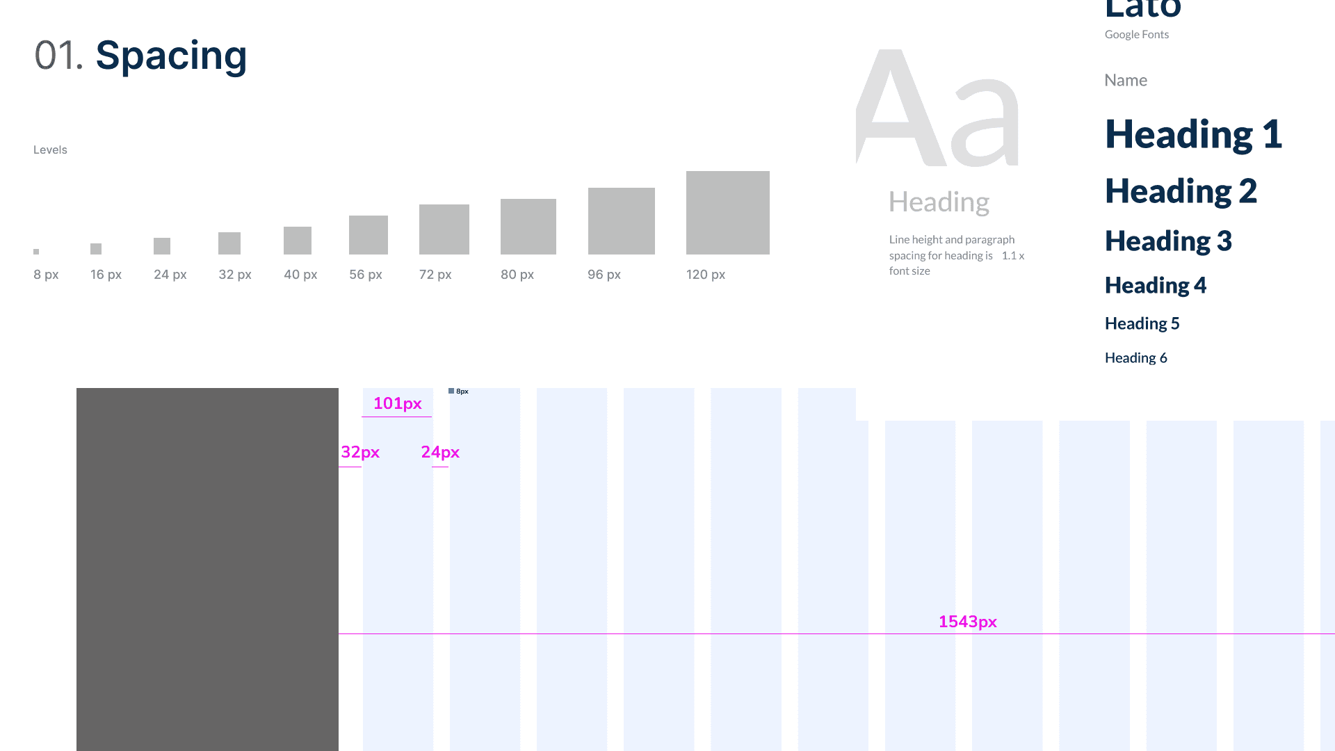
Defining the Foundation
To maintain consistency throughout the product, they badly needed a consistent font, weights for that font, and Sizing and spacing conventions.
They didn't have this before I engaged with them. I established a grid system to ensure alignment and responsiveness, defined typography, spacing to create visual harmony.
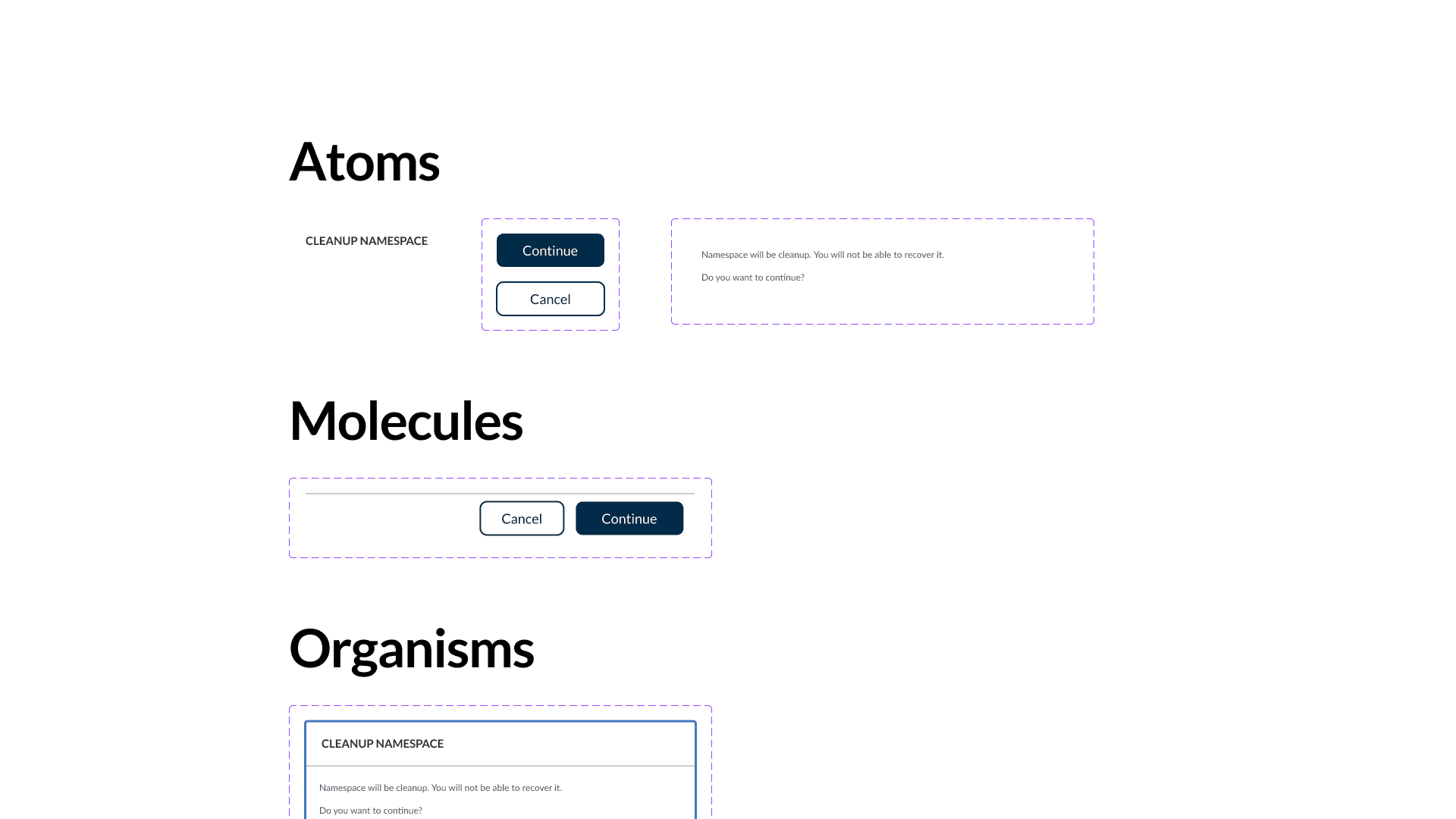
Building Atomic Components
I Applied an atomic design approach, starting with the creation of core elements Buttons with consistent states and actions, form inputs and selectors with clear visual hierarchy, modals and tables designed to handle complex data.
Side Navigation
I designed a side navigation system that balances clarity and functionality, incorporating:
Parent-Child Structure: Clear hierarchy representation, making it intuitive to navigate through multiple layers.
Dissolve Style: Smooth transitions to enhance visual feedback.
Expandable/Collapsible Menus: Optimized for space, allowing users to expand sections as needed while keeping the interface clean.